Tuesday, September 2, 2008

Tech Tuesday: Better B&W From Digital

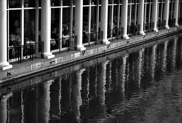
Loeb Boathouse - Just Removed the ColorOK, I'll let you in on a secret - much of what I've learned about Photoshop Elements is from Scott Kelby's excellent books - I think he's written one for each version so far - I'm a little behind the times right now, so I'm still using The Photoshop Elements 4 Book for Digital Photographers.

One of the things I know very little about is how to get a decent B&W image from a color digital photo... but yep, Scott goes into that, too.

Loeb Boathouse - Better B&W using Scott Kelby's technique
Here's the general outline to how he says to do it:

  • Open the color image in Photoshop Elements.

  • Make sure the foreground color is Black and the background color is White (or as Scott says, just press the "D" key - this will set your foreground and background colors exactly this way.)

  • Go to the Layers palette and choose Levels from the Create Adjustment Layer drop-down menu (it's the half-black, half-white circle icon.) Once the Levels dialog comes up, just click OK.

  • Now again, from the Layers palette, chose Gradient Map from the drop-down menu and just click OK on the Gradient Map dialog. This will give you a B&W image, and you should notice that it already looks better than just using the standard commands to create a grayscale image (Image/Mode/Grayscale, or Enhance/Adjust Color/Remove Color.)

  • Here's where you can tweak the B&W tones a bit. First, in the Layers palette, double-click right on the Levels thumbnail to bring up the Levels dialog. Select Red from the Channel drop-down list, and then play a bit with the black-point slider to the right to increase shadows until you see what you like.

  • Without clicking OK, select Green from the Channel drop-down list, and this time try dragging the white point slider to the left to increase highlights.

  • Again, don't click OK yet - now pick Blue from the Channel drop-down list and try playing with the highlights (quite a bit) and the shadows (just a little.)

  • You can go back and forth between the 3 channels, tweaking away - just stop when you're happy with the look, then finally click OK in the Levels dialog.

At this point, mush the layers you created into one layer with the Layers/Flatten menu. The file still has color information in it - if you want to save file space, you can turn it into a grayscale file with Image/Mode/Grayscale.

For this photo, once I got to this point, I applied local contrast sharpening as I usually do (see this post for how to do that) and then final sharpening. You can see the results in the second image - compare that one to the standard remove-the-color version at top. To paraphrase those laundry soap commercials - whiter whites, blacker blacks, and just nicer overall tonality.

Amazingly, I even got an excellent B&W print of this second image on my 3-1/2-year-old Canon i850 printer. I would have expected some tinting, at least in some areas of the photo, but this print looks like an old-fashioned paper-and-developer B&W print (I doubt that this will work out so well for every image - normally you need an inkjet printer that's designed to do B&W, such as some of the higher-end Epsons.)

If you use Photoshop or Photoshop Elements, check out Scott Kelby's books - he packs them with excellent practical how-to advice.

Monday, September 1, 2008

Sunless Sunrise Meetup

Happy Labor Day!

Shutterbug Excursion Meetup in AnnapolisThis past Saturday, I had organized an early-morning event for our photo Meetup group, Shutterbug Excursions, for 6am in Annapolis. It was a last-minute thing whose theme was "Greet the Sunrise," and at best, I expected three or four other die-hards to show up.

Instead, we had twelve enthusiastic Excursionaires - our largest Meetup to date. In the photo above by George Skeption, you can see (left to right) George, Carol, Dan, Quilly, Josh, Your Intrepid Correspondent, Tracey, Elsa, and Gary.

Got To Go!


Perfect Coil - Annapolis MDThe main idea of this Meetup was to experience the magical morning light as we walked around sailboat country, but as luck would hav it, this turned out to be a sunless morning. This didn't faze the Excursionaires one bit; you can see some of their photos from the event here.

By 8:30am we were in Eastport, tired and hungry, so I led the gang back across the Spa Creek bridge and up Main Street to Chick & Ruth's Delly for breakfast.

Chick & Ruth's is an Annapolis institution. As usual, it was packed on a Saturday morning with locals and visitors, including a group of Naval Academy graduates from the class of 1968 (I didn't see Senator Webb, unfortunately.) Owner Ted Levitt nevertheless quickly found us seats close together, and we enjoyed a good breakfast with lots of fun schmoozing.

To cap off the morning, we got to participate in a Chick & Ruth's tradition: at 9:30, everyone in the restaurant stopped, stood up, faced the large flag in the middle of the place, and recited the Pledge of Allegiance.

Friday, August 29, 2008

Spotlight on "Sidereal"


'Happy Rain' by Sidereal
Sidereal is the Flickr username of a very talented photographer whose work we can all learn from.

I stumbled across some of his photos on Flickr.com when I was looking for some pictures of the Canton neighborhood in Baltimore. This led me to his photostream, where many of his images of ordinary items and scenes just blew me away.

Apparently, Sidereal lives in Randallstown, the area in Baltimore County where I grew up. Familiarity having in me bred contempt, I have thought of Randallstown as a pictorially nothin' happenin' place. But Sidereal's Randallstown photo set has made me see the error of my ways.

Sometimes we photographers get in a rut and think that if we could only travel to someplace picturesque and exciting, we'd be able to make compelling photos. Sidereal reminds us that amazing images sit in our own back yards, just waiting for us to frame them.

Thursday, August 28, 2008

Photogenic Boston

Trinity Church reflected in Hancock TowerThe weekend before last, we were in Boston for the wedding of one of the sons of dear friends of ours. Aside from the happy occassion, I was delighted to be in Boston after an absence of more than 30 years.

Arriving in Boston by car, I got that same rush of endorphins that I experience every time I'm on that long, sweeping curve of Lincoln Tunnel ramp in Weehauken that gives you your first close-up look at the Manhattan skyline.

Boston is a beautiful city filled with compelling architecture, from colonial to postmodern. Spending every workday as I do in architecturally-challenged Baltimore, being here was quite a treat.

Swan Boats - Boston GardenThe morning after the wedding, I was out of my hotel room by 6:30 AM, I walked past the Boston Public Library, a Beaux-Arts beauty by McKim, Mead and White, Trinity Church, and the Hancock Tower, the worthy skyscraper-regnant of the Back Bay skyline. Then just a few blocks east to Boston Garden and the famous Swan Boats, which I'd never seen in real life.

The clear day and the early hour made for beautiful morning sidelighting and nice reflections. I haven't gotten out this early to photograph in quite a while, but it really paid off.

On the way back to the hotel, looped back around the other side of the Hancock Tower for some more photos. One I had in mind was an image of the older 1947 John Hancock Building, "Little John", with the newer tower, "Big John", in the background. Here's the result - as it was still before 8AM, the western sky behind Big John was still a deep blue - no polarizer needed! I really like the contrast between the blocky, robust, all-granite design of John the Elder and the slender, pane-of-glass look of John Junior.

I remember the growing pains that the Hancock Tower went through in the mid- to late-70's. Most dramatic, even frightening, was the problem with entire windowpanes popping out and plunging, all forty-four square feet of them, hundreds of feet to the pavement below. Years went by with many empty windows replaced with plywood panels, and some took to calling the skyscraper "Plywood Palace." Another problem was a pronounced and nauseating sway of upper floors in high winds.

More than 30 years later, all of these problems have been solved, and I was able to enjoy Big John and its relationship to its surroundings in peace and confidence.

I wouldn't want to live there (I've become a complete cold-weather wimp in my old age,) but it's sure a nice place to visit. Good-looking people, great food, eye-pleasing architecture. If you haven't been there yet, I hope you get an opportunity to go - and bring your camera.

Wednesday, August 27, 2008

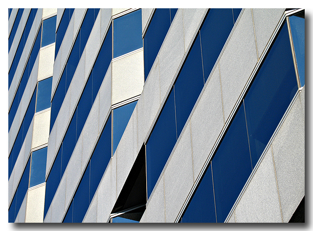
250 W Pratt - Abstract

250 W Pratt Street - Baltimore, MDWhen it comes to skyscrapers, Baltimore is an architecturally impaired city, but there are a few exceptions. This is one of them, one of my favorites in Baltimore, 250 W Pratt Street.

This 1986-vintage, 24-floor building was designed by Skidmore, Owings & Merrill. It's 360 feet tall (110 m), and its half-ziggurat profile and handsome banding make it a real standout any city would be proud the call its own.

Tuesday, August 26, 2008

Tech Tuesday: Photoshop 80-20 Rule

Believe me, I'm no expert in Photoshop, but I've found that like many things in life, there is an 80-20 Rule that seems to apply. That is, you can get 80 percent of the benefit out of Photoshop by using 20 percent (or less) of its considerable array of tools.

Here is an example of that - Except for cropping, it's the first series of steps that I use on a .jpg file out of my camera. It only uses two tools, Levels and Unsharp Mask, and takes about two minutes if you do it slowly. But it really has improved the look of my images.


Now I happen to use Photoshop 4.0, a "ligher" version of Photoshop, but the same steps apply to honest-to-gosh Photoshop.


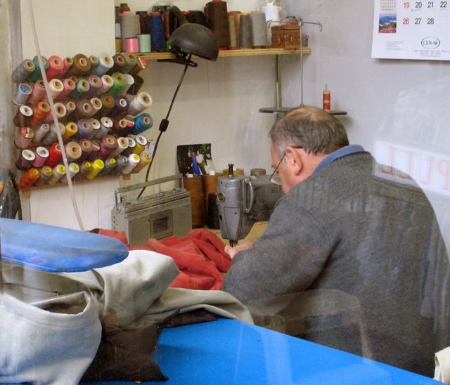
Tenth Street Tailor - Crop from Original FileHere is an image that, except for cropping, came right out of my Canon A620. I took it through the window of a tailor shop on Tenth Avenue in NYC on a cloudy day. The color balance is off - too blueish- and the image just has no snap - it's as dull as the weather outside.
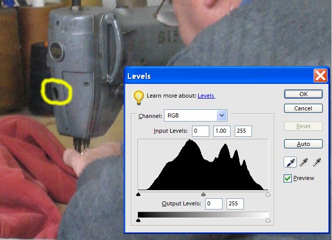
Set the Black PointThe first thing I did was to bring up the Levels dialog (CTL-L). What I want to do now is key Photoshop into the blackest black in the image. To do that, I selected the Black Point eyedropper (the one on the left) and clicked it on that black patch (I think it's a hole) on the sewing machine.
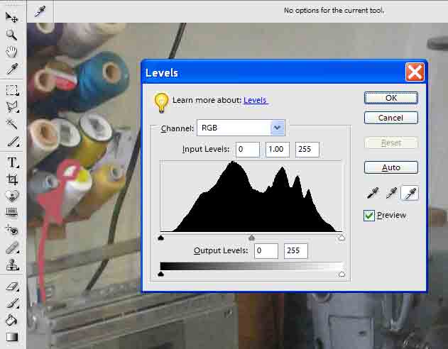
Set the White PointNext, with the Levels dialog still open, I picked the White Point eyedropper (the one on the right) and clicked it to what I wanted to be the whitest white in the photo - in this case, the top of a white spool of thread.
Set the Medium Gray PointBefore I closed the Levels dialog, I picked the Gray Point eyedropper (the one in the middle) and clicked it on something that should be medium-gray, in this case, the tailor's sweater.
Tenth Street Tailor - Crop from Original FileI've repeated the original photo again here, so that you can easily compare it to the color-corrected image below.
Tenth Street Tailor - Color CorrectedHere is the color-corrected image that results after setting the black, white, and gray points and clicking OK in the Levels dialog. Compare this image to the original. Note the skin tones seem about right, and the overall bluish cast is gone. Also, the overall contrast is much better - it's as if you stripped a layer of dirty transparent film off of the photo.
Tenth Street Tailor - Local Contrast Sharpening AppliedAt this point, I usually do something that I recently found on the excellent website Luminous Landscape - it's called Local Contrast Enhancement and it's dead simple, but I find it makes a big difference.

Using the main menu, select on Filter/Sharpen/Unsharp Mask, which brings up the Unsharp Mask dialog. Select an Amount value of 20, a Radius value of 50, and a Threshold value of 0 (zero.) Before you close the dialog, click the Preview checkbox on and off a few times to see the effect. This technique adds a lot of snap to an image with almost none of the adverse affects of sharpening.


You can see the difference between the last two photos above. In the final photo, I applied Local Contrast Enhancement.

If you'd like to learn more about why this works, there is a good article here on the Luminous Landscape website.

Depending on what I'm going to do with the image (i.e., display it on the web or print it,) I usually do some "normal" sharpening as a final step, again using the Unsharp Mask.

I hope you find these few simple steps useful. I'll try to add some more Photoshop tips over the next few weeks. But if what I've shown you today isn't a great example of the 80-20 rule, I don't know what is.

Monday, August 25, 2008

Impulse Photography with a Digicam

Acton Cove Punt - Annapolis, MDOne of the great things about having a good-quality little camera is that you can do impulse photography. Sure, you've heard of impulse buying - well this is the same thing, but with taking photos. You can't impulse buy unless you have money, or more likely a credit card, on you. Likewise, you can't impulse-photograph unless you've got a camera on you.

And this has been the absolute best thing about my digicam, (a 2006-vintage Canon A620) as far as I'm concerned. It's small enough that I take it with me pretty much everywhere, and when the mood strikes, I'm ready to shoot.

I was in Annapolis this morning - not scenic Annapolis, but a few blocks away in the nothing-doing-nothing-interesting part. After my business there was over, though, I remembered seeing a nice photo the other day taken at Acton Cove, which was only a few minutes drive away. Acton Cove is on picturesque Spa Creek, and I had my Canon A620 in my jacket pocket, so there you go.

No big deal - just a few photos on an impulse. Little time expended and little risk involved. If I end up with nothing good, who will know?

The little punt that was tied up at the small public dock at Acton Cove had a nice shape, and with a little Photoshop to compensate for the flat lighting, I ended up with a pretty nice impulse photo.

Retractable SharpiesBefore I headed home, I needed a sheet of black mat board, so I headed over to Art Things, which was right on the way. They always have some sort of nice display on their porch, and this time, what caught my eye was a container full of different-colored, retractable Sharpies.

Out came the Canon A620, and I took a quick photo. Whoops, I got that little shakey-camera icon on the LCD, and sure enough, the shot looked a little blurry. A few button presses, and I switched from ISO 50 to ISO 200. Picture taken, problem solved.

Impulse satisfied.