Showing posts with label Photoshop. Show all posts

Tuesday, September 23, 2008

Tech Tuesday: Color Correction - What If You Can't Find Black or White?

In a previous Tech Tuesday post, I showed you how to add a lot of snap to your photos by color-correcting them using the darkest black and whitest white points in your image.

But what happens when you just can't find something that should be a good black or a good white?

Here's an example of such a problem-child photo; it' hard to pick out either a black point or a white point in this image.

One of the problems is that the photo was a little underexposed, so you may not see a good patch of white anywhere - it may look like light gray.

But it turns out that most versions of Photoshop and Photoshop Elements will help you find those black and white points with just a little bit of work.


You need to make sure your Layers palette is showing. If it isn't, click on the Windows menu item and choose Layers. Now click on the little divided circle near the top of the palette to drop down the menu, and select Threshold.


Now you'll see that your photo shows up in very high-contrast black and white, with a Threshold dialog floating above it.

Drag the slider under the histogram all the way to the left, and your photo will go completely white.

Now very slowly, drag the slider back towards the right, and at some point, you'll see some areas of your image reappear as black, as you see in this photo. These areas are the darkest ones in your image. What you need to do is to note where they are - click the Preview checkbox off and on a few times so that you can fix in you mind just what part of the photo you want to set to black.


Now drag the slider all the way to the right, and you'll see the whole photo go black. As before, drag the slider very slowly, but this time to the left, and you'll begin to see some parts of your image appear in white. These are the lightest parts of your photo. Again, use the Preview checkbox to fix in your mind just which part of the photo you want to use as the brightest.


Now that you know the blackest and whitest points in your image, click Cancel on the Threshold dialog, and use press CTL-L to bring up the Levels dialog.

Use the black point and white point eyedroppers to select the darkest and lightest parts of your photo, as you learned a few weeks ago.

What about setting the gray point? Well, in this photo, there was plenty of neutral gray in the cobblestoned surface of the plaza, but that isn't always the case.

Next Tuesday, I'll show you a technique for finding neutral gray.

By the way, all of these cool photoshop techniques - I can't claim credit for them. I learned them by reading books and articles by Scott Kelby. What Scott doesn't know about Photoshop probably isn't worth knowing, and on top of all that, he's a wonderful writer.

Tuesday, September 16, 2008

Tech Tuesday: Architectural Restoration

Why is it that when I take a picture of a tall building, it often looks distorted? Gee, those walls sure looked perpendicular to the ground and parallel to each other when I was standing there! But in the image I come home with, the walls are at all sorts of angles, and the building looks like it's falling over backwards.

Take, for example, the photo here of 160 W. 73rd Street, a lovely Art Deco co-op typical of many of the elegant older apartment buildings on the Upper West Side of Manhattan.

I framed the image carefully in my viewfinder, trying to line up the setback on the right edge so that it looked veritcal. Here's what the image looked like right out of my camear in Photoshop Elements 4. Notice how the left side of the building "leans" like a rickety shore shack, rather than the quite solid limestone-and-brick edifice it really is.

So why does this happen? I'll tell you why. When you point the camera straight at a building, the film plane (or for a digital camera, the plane of the sensor) is parallel to the building. This is great, because parallel lines in the building will come out parallel in the photo, and there will be no distortion.

The problem is, if I did that with my photo of 160 W 73rd Street, I would have gotten a lovely picture of the lobby and the awning. Not quite what I wanted. So of course, I tilted my camera upward to include the top of the building.

But now, the film/sensor plane is no longer parallel to the building, and I get perspective projection distortion. How do I correct this? In the realm of 35mm and DSLRs, there are special, usually expensive perspective control lenses that allow you to tilt and shift the lens relative to the film/sensor plane. Here's a good, well-illustrated article by Ken Rockwell that explains this very well.

View cameras (the kind where the photographer focuses on a screen under a dark cloth) usually have camera movements to control perspective distortion and other problems. But we can accomplish our goal of un-distorting our tall buildings using some simple tricks in even the older versions of Photoshop and Photoshop Elements.

Start with the Image menu, and select Transformation, and then Skew. You'll see a dialog like this one. Just click the OK button.


This will bring up the New Layer dialog. While it's good practice to name layers with a meaningful name, we'll be throwing this layer away soon anyway, so just click the OK button and continue to the next step. (Layers are a subject for a whole other post, or really several posts.)

At this point, you'll see a thin box around the entire image. The box also has tiny circles at each of the corners and at the midpoint along each side. You can grab the box at any one of the circles (think of them as "handles") and tug or push your image.

You can see here how I tugged the top left corner of my photo to "un-tilt" the building. I used my calibrated eyeballs to tell me just how much to tug.

There will be times when you'll take a photo of a tall building straight-on, but still tilted up. In that case, both sides of the building may appear to fall away. So can you do this same maneuver with the other side? Sure! As I said, you can push or pull any of the "handles" until your photo looks right to you.

Here is the final photo, after I gave it my 30-second Photoshop 80-20 Rule treatment to color-correct and contrast-sharpen the image.

By the way, in the latest versions of Photoshop, there are other, sometimes easier or better ways to do perspective distortion correction. But if you're like me, you just don't have the big bucks to buy Photoshop CS3. That's why I'm showing these techniques that you can do even with just an old copy of Photoshop Elements 2 (if you search carefully online, you should be able to by a perfectly good, perfectly legal OEM copy of PSE 2 for about twenty bucks.)

Sunday, September 7, 2008

Doo, Doo, Doo Lookin' Out My Front Door!

I opened my front door one night and there she was, already having spun a pictorially perfect composition - must have known a photographer lived there.

I just used flash to illuminate spider and web, while leaving the nighttime front yard dark.

In Photoshop, I applied a reverse B&W gradient map (the small gray areas are tree leaves that barely left any shadow detail in the original.)

That's it - no cropping even!

Tuesday, September 2, 2008

Tech Tuesday: Better B&W From Digital

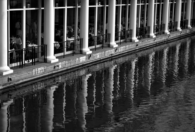
Loeb Boathouse - Just Removed the ColorOK, I'll let you in on a secret - much of what I've learned about Photoshop Elements is from Scott Kelby's excellent books - I think he's written one for each version so far - I'm a little behind the times right now, so I'm still using The Photoshop Elements 4 Book for Digital Photographers.

One of the things I know very little about is how to get a decent B&W image from a color digital photo... but yep, Scott goes into that, too.

Loeb Boathouse - Better B&W using Scott Kelby's technique
Here's the general outline to how he says to do it:

  • Open the color image in Photoshop Elements.

  • Make sure the foreground color is Black and the background color is White (or as Scott says, just press the "D" key - this will set your foreground and background colors exactly this way.)

  • Go to the Layers palette and choose Levels from the Create Adjustment Layer drop-down menu (it's the half-black, half-white circle icon.) Once the Levels dialog comes up, just click OK.

  • Now again, from the Layers palette, chose Gradient Map from the drop-down menu and just click OK on the Gradient Map dialog. This will give you a B&W image, and you should notice that it already looks better than just using the standard commands to create a grayscale image (Image/Mode/Grayscale, or Enhance/Adjust Color/Remove Color.)

  • Here's where you can tweak the B&W tones a bit. First, in the Layers palette, double-click right on the Levels thumbnail to bring up the Levels dialog. Select Red from the Channel drop-down list, and then play a bit with the black-point slider to the right to increase shadows until you see what you like.

  • Without clicking OK, select Green from the Channel drop-down list, and this time try dragging the white point slider to the left to increase highlights.

  • Again, don't click OK yet - now pick Blue from the Channel drop-down list and try playing with the highlights (quite a bit) and the shadows (just a little.)

  • You can go back and forth between the 3 channels, tweaking away - just stop when you're happy with the look, then finally click OK in the Levels dialog.

At this point, mush the layers you created into one layer with the Layers/Flatten menu. The file still has color information in it - if you want to save file space, you can turn it into a grayscale file with Image/Mode/Grayscale.

For this photo, once I got to this point, I applied local contrast sharpening as I usually do (see this post for how to do that) and then final sharpening. You can see the results in the second image - compare that one to the standard remove-the-color version at top. To paraphrase those laundry soap commercials - whiter whites, blacker blacks, and just nicer overall tonality.

Amazingly, I even got an excellent B&W print of this second image on my 3-1/2-year-old Canon i850 printer. I would have expected some tinting, at least in some areas of the photo, but this print looks like an old-fashioned paper-and-developer B&W print (I doubt that this will work out so well for every image - normally you need an inkjet printer that's designed to do B&W, such as some of the higher-end Epsons.)

If you use Photoshop or Photoshop Elements, check out Scott Kelby's books - he packs them with excellent practical how-to advice.

Tuesday, August 26, 2008

Tech Tuesday: Photoshop 80-20 Rule

Believe me, I'm no expert in Photoshop, but I've found that like many things in life, there is an 80-20 Rule that seems to apply. That is, you can get 80 percent of the benefit out of Photoshop by using 20 percent (or less) of its considerable array of tools.

Here is an example of that - Except for cropping, it's the first series of steps that I use on a .jpg file out of my camera. It only uses two tools, Levels and Unsharp Mask, and takes about two minutes if you do it slowly. But it really has improved the look of my images.


Now I happen to use Photoshop 4.0, a "ligher" version of Photoshop, but the same steps apply to honest-to-gosh Photoshop.


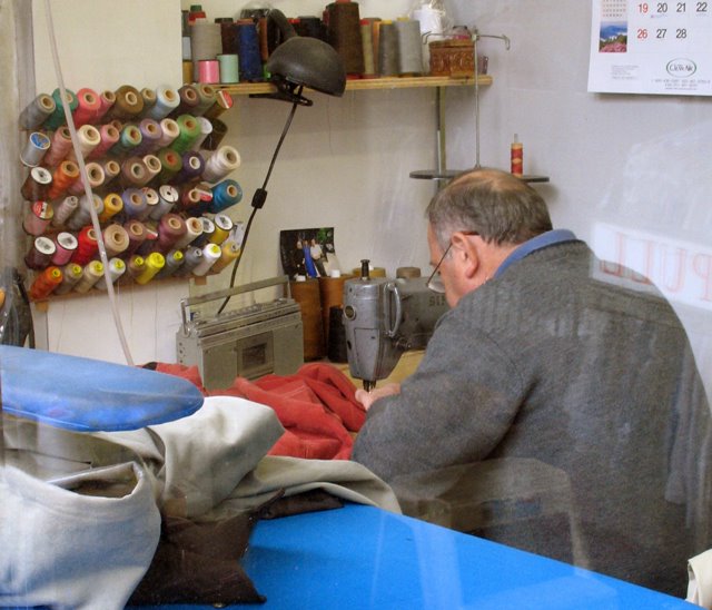
Tenth Street Tailor - Crop from Original FileHere is an image that, except for cropping, came right out of my Canon A620. I took it through the window of a tailor shop on Tenth Avenue in NYC on a cloudy day. The color balance is off - too blueish- and the image just has no snap - it's as dull as the weather outside.
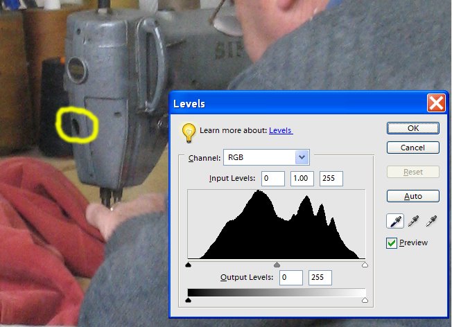
Set the Black PointThe first thing I did was to bring up the Levels dialog (CTL-L). What I want to do now is key Photoshop into the blackest black in the image. To do that, I selected the Black Point eyedropper (the one on the left) and clicked it on that black patch (I think it's a hole) on the sewing machine.
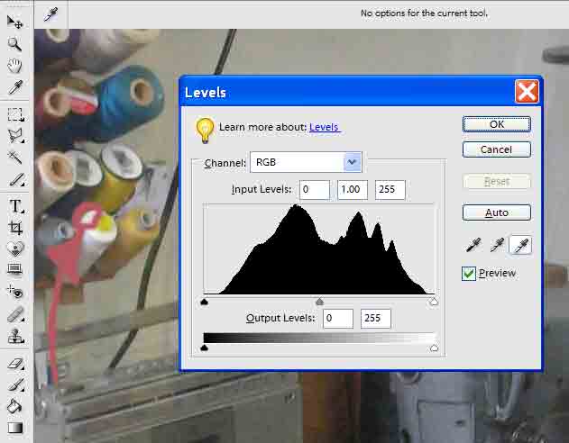
Set the White PointNext, with the Levels dialog still open, I picked the White Point eyedropper (the one on the right) and clicked it to what I wanted to be the whitest white in the photo - in this case, the top of a white spool of thread.
Set the Medium Gray PointBefore I closed the Levels dialog, I picked the Gray Point eyedropper (the one in the middle) and clicked it on something that should be medium-gray, in this case, the tailor's sweater.
Tenth Street Tailor - Crop from Original FileI've repeated the original photo again here, so that you can easily compare it to the color-corrected image below.
Tenth Street Tailor - Color CorrectedHere is the color-corrected image that results after setting the black, white, and gray points and clicking OK in the Levels dialog. Compare this image to the original. Note the skin tones seem about right, and the overall bluish cast is gone. Also, the overall contrast is much better - it's as if you stripped a layer of dirty transparent film off of the photo.
Tenth Street Tailor - Local Contrast Sharpening AppliedAt this point, I usually do something that I recently found on the excellent website Luminous Landscape - it's called Local Contrast Enhancement and it's dead simple, but I find it makes a big difference.

Using the main menu, select on Filter/Sharpen/Unsharp Mask, which brings up the Unsharp Mask dialog. Select an Amount value of 20, a Radius value of 50, and a Threshold value of 0 (zero.) Before you close the dialog, click the Preview checkbox on and off a few times to see the effect. This technique adds a lot of snap to an image with almost none of the adverse affects of sharpening.


You can see the difference between the last two photos above. In the final photo, I applied Local Contrast Enhancement.

If you'd like to learn more about why this works, there is a good article here on the Luminous Landscape website.

Depending on what I'm going to do with the image (i.e., display it on the web or print it,) I usually do some "normal" sharpening as a final step, again using the Unsharp Mask.

I hope you find these few simple steps useful. I'll try to add some more Photoshop tips over the next few weeks. But if what I've shown you today isn't a great example of the 80-20 rule, I don't know what is.

Tuesday, July 15, 2008

Flag Ladder Foolery

Flag LadderAt the carnival the other morning, I found this "flag ladder" lying next to a white trailer. I propped it up against the trailer, noticed the strong shadow, and liked the shapes and colors.

Back in the lab, the deep black shadows my eyes saw turned out to be not-so-deep greyish-blue. The photo at left is about the best I could do by just setting the trailer to white point in the Levels control (I use Photoshop Elements 4, so I don't have access to curves.)

I still wanted to see what my eyes "saw", so I used the polygonal lasso tool to select the shadow areas and make them really black. While I was at it, I lassoed the colored parts of the ladder so as to bring up the white areas.


Flag Ladder - ModifiedHere's what the end result looks like. Definitely more dramatic, but did I overdo it? (BTW, the jpg here shows some jaggies along the edges of the black shadow, but in the full-sized image, the edge is very clean.)

What do you think?