Juggling flaming torches while balancing eight feet up on a unicycle? Sure, all in a day's work for this street entertainer, performing at Baltimore's Inner Harbor.
These people don't get paid by anyone, they're dependent on our tips. So when you see one doing a good job, be kind and put a few bucks in the hat.
Tuesday, July 29, 2008
Tuesday, July 22, 2008
Charles Center South Reflections
I thought I'd check out the other side of Charles Center South, so I walked into Charles Center Plaza and up a ramp that took me around the Federal Building.
As you can see, the view is quite nice at about 6pm, with great reflections of the M&T Bank Building (1973) and Baltimore's original skyscraper, the Bank of America Building (1929.)
A federal security officer came by to check me out - his concern was that I not take photos of the Federal Building (which, unfortunately, is not a very good-looking building.) I showed him what I was doing on the LCD screen of my digicam, and it turns out that he's a photographer himself. We chatted a bit, and he invited me to stop by again to talk photography!
Labels:
Architecture,
Baltimore,
Canon A620,
Reflections
Monday, July 21, 2008
Urban Geometry
I've griped before about the dearth of decent modern architecture in Baltimore, but here's an edifice I may have overlooked - Charles Center South.
I haven't quite made up my mind, but at first glance, this 25-story curtain-wall black glass building stands out from its contemporaries as being more elegant. The tower stands at the nothwest corner of Charles and Lombard, a block away from my normal daily trek from Light Rail to work. For most of my walk, other buildings block the view.
Designed by the very fine Baltimore architectural firm RTKL Associates, Charles Center South was completed in 1975. The irregular hexagonal plan of the building gives it a more faceted appearance, especially in comparison to the foursquare 1973 Legg Mason building, the one reflected in this photo.
I decided to give Charles Center South a quick once-over last Friday on the way home, walking west on Lombard Street rather than Pratt. I snapped a few photos and moved on, but then looking back, I saw this composition of diagonals and triangles.
Friday, July 18, 2008
Yellow Crane
A simple composition, bright yellow diagonal against a black background.
This is Version 1.0 of this scene - I need to try it again. The subject matter is about six blocks west of our office building, and I shot this through a window. Just now, it occurs to me that I can step through the fire exit door just next to the window and shoot almost the same scene with no glass in the way (our 1930's building has an outside fire stairway.)
Shot with my Canon XSi and Sigma 70-300mm lens, zoomed out to just under 300mm.
Labels:
Architecture,
Baltimore,
Canon 450D,
Composition,
Image Stabilization,
Telephoto
Tuesday, July 15, 2008
A Good Day for Flags
Flag Ladder Foolery
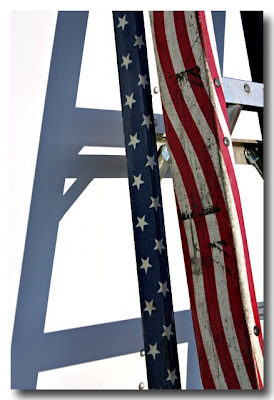
At the carnival the other morning, I found this "flag ladder" lying next to a white trailer. I propped it up against the trailer, noticed the strong shadow, and liked the shapes and colors.
Back in the lab, the deep black shadows my eyes saw turned out to be not-so-deep greyish-blue. The photo at left is about the best I could do by just setting the trailer to white point in the Levels control (I use Photoshop Elements 4, so I don't have access to curves.)
I still wanted to see what my eyes "saw", so I used the polygonal lasso tool to select the shadow areas and make them really black. While I was at it, I lassoed the colored parts of the ladder so as to bring up the white areas.
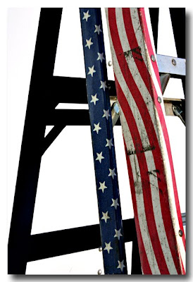
Here's what the end result looks like. Definitely more dramatic, but did I overdo it? (BTW, the jpg here shows some jaggies along the edges of the black shadow, but in the full-sized image, the edge is very clean.)
What do you think?
Labels:
Canon 450D,
Canon XSi,
Carnival,
Photoshop,
Shapes
Friday, July 11, 2008
Earleigh Heights Volunteer Fire Company Carnival
Around our way, the Earleigh Heights Fireman's Carnival heralds midsummer. This year, it's a week or so... uh, early.
Nevermind, though, it's still a colorful photo-opportunity. I thought the dramatic shots would be limited to nighttime, but I noticed that there's also dramatic morning sidelighting while it's still...uh, early.
Labels:
Canon 450D,
Canon XSi,
Carnival,
Earleigh Heights
Monday, July 7, 2008
The Mini-Cooper of Tanks
Ben came "home" to celebrate a friend's birthday, and I suggested that rather than taking the bus back to Philly Saturday night, I'd drive him back on Sunday.
On the way up US 95, I decided to make an impromptu visit to the Army Ordinance Museum at Aberdeen Proving Grounds. I'd taken the kids when they were quite small, so long ago that Ben doesn't remember the trip.
Here, Ben stands by a French Hotchkiss H35 Light Tank, a machine that may have been as dangerous to its operators as to the enemy. But newly renovated in that very cool paint scheme, Ben thought it would be nice for tooling around Philly.
Update 7/8/2008: Whoops, I insulted this tank - but not by much. It's actually a Renault R35. Why does it not surprise me that the French made crappy pre-war tanks?
Labels:
Aberdeen Proving Grounds,
Ben,
Ordinance Museum,
Tank
Saturday, July 5, 2008
Friday, July 4, 2008
Outside Pitch
While waiting for the train to head home today, I snapped some photo of the new Sports Museum next to my stop. There was a crowd heading to tonight's Orioles game, and vendors were out in force.
I met this friendly fellow, Kurt, a vendor for Outside Pitch, an Orioles fan magazine, and asked him if I could take his photo. Kurt obliged with a smile and a nice action pose.
Thursday, July 3, 2008
Reginald F. Lewis Museum
The Reginald F. Lewis Museum of Maryland African American History & Culture is one of those places that I've just got to get to one of these days. It's less than two blocks from where I work, so I really don't have any excuse for not at least stopping by on a lunch break.
Reading Mr. Lewis' biography just a little while ago might just inspire me to go. Reginald Lewis grew up in a tough part of Baltimore, and by dint of hard work and perseverence, worked his way through college and eventually Harvard Law School. He founded the first African-American-led law firm on Wall Street, and in the '80s, became a CEO several times in leveraged buy-outs that saved and turned around several companies.
Mr. Lewis was also a great philanthropist, endowing foundations, scholarships, and other worthy causes with over 10 million dollars before his untimely death at age 50 in 1993.
The museum is a postmodern building that just shouts out to be photographed, as you can see.
Wednesday, July 2, 2008
Spider Man
Tuesday, July 1, 2008
Bromo Tower at Dusk
Sometimes it pays to work late.
I was heading back to the Light Rail stop about 9 PM tonight, and the sky was geting darker, but not yet black. Looking up just about a half-block away from my stop, I noticed how the nicely-lit the Bromo Tower contrasted with the dark blue sky.
I didn't bring one of my small digicam tripods with me today, but there was a handy, flat-topped traffic barrel in just about the right spot to rest Ben's flat-sided Canon A630. I took about 25 exposures at the longest tele setting (equivalent to 135mm on 35mm) from ISO 80 to 400. This was the best of the lot at ISO 100.
Labels:
Architecture,
Baltimore,
Bromo Tower,
Canon A630,
Night Photography
The Power Of Critique
My friend Warren at Friendly Photo Forummade a suggestion to crop out the "OAT RENTALS" at the top of the photo. I was just a bit skeptical - I had rather liked the bold, white-on-black lettering, but tried it.
Well, now I'm with Warren - the composition looks cleaner and more balanced to me now.
Here's some more feedback from Dolph on the same forum: "When I read about this art form, they always come back to 'keep it simple.' I like the second composition better. The original was attempting to tell two stories. This has one, and gives me the feeling of being at the docks ready to go fishing."
Well put - I think that makes sense.
What do you think?
Thanks, Warren!
Subscribe to:
Posts (Atom)