 OK, I'll let you in on a secret - much of what I've learned about Photoshop Elements is from Scott Kelby's excellent books - I think he's written one for each version so far - I'm a little behind the times right now, so I'm still using The Photoshop Elements 4 Book for Digital Photographers.
One of the things I know very little about is how to get a decent B&W image from a color digital photo... but yep, Scott goes into that, too.

Here's the general outline to how he says to do it:
- Open the color image in Photoshop Elements.
- Make sure the foreground color is Black and the background color is White (or as Scott says, just press the "D" key - this will set your foreground and background colors exactly this way.)
- Go to the Layers palette and choose Levels from the Create Adjustment Layer drop-down menu (it's the half-black, half-white circle icon.) Once the Levels dialog comes up, just click OK.
- Now again, from the Layers palette, chose Gradient Map from the drop-down menu and just click OK on the Gradient Map dialog. This will give you a B&W image, and you should notice that it already looks better than just using the standard commands to create a grayscale image (Image/Mode/Grayscale, or Enhance/Adjust Color/Remove Color.)
- Here's where you can tweak the B&W tones a bit. First, in the Layers palette, double-click right on the Levels thumbnail to bring up the Levels dialog. Select Red from the Channel drop-down list, and then play a bit with the black-point slider to the right to increase shadows until you see what you like.
- Without clicking OK, select Green from the Channel drop-down list, and this time try dragging the white point slider to the left to increase highlights.
- Again, don't click OK yet - now pick Blue from the Channel drop-down list and try playing with the highlights (quite a bit) and the shadows (just a little.)
- You can go back and forth between the 3 channels, tweaking away - just stop when you're happy with the look, then finally click OK in the Levels dialog.
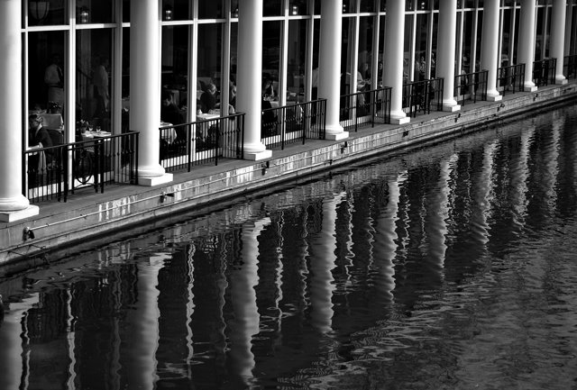
For this photo, once I got to this point, I applied local contrast sharpening as I usually do (see this post for how to do that) and then final sharpening. You can see the results in the second image - compare that one to the standard remove-the-color version at top. To paraphrase those laundry soap commercials - whiter whites, blacker blacks, and just nicer overall tonality.
Amazingly, I even got an excellent B&W print of this second image on my 3-1/2-year-old Canon i850 printer. I would have expected some tinting, at least in some areas of the photo, but this print looks like an old-fashioned paper-and-developer B&W print (I doubt that this will work out so well for every image - normally you need an inkjet printer that's designed to do B&W, such as some of the higher-end Epsons.)
If you use Photoshop or Photoshop Elements, check out Scott Kelby's books - he packs them with excellent practical how-to advice.
No comments:
Post a Comment